Trade Fixtures – New Brand Development
An effective logo tells a story about the brand it represents. After years of success with its previous graphic identity, Trade Fixtures turned to C-22 to develop a new look. This new identity would better represent its position in the bulk food marketplace. Trade Fixtures is a leader in the production of dispensing equipment for bulk foods sold at retail. Trade Fixtures was looking for a logo and branding that was in line with the freshness and eco-friendliness of bulk shopping. Following interviews with company leaders to gain insights on strategies and goals, C-22 developed a new brand mark, graphic template and color system. Since then, these have been extended across all platforms.
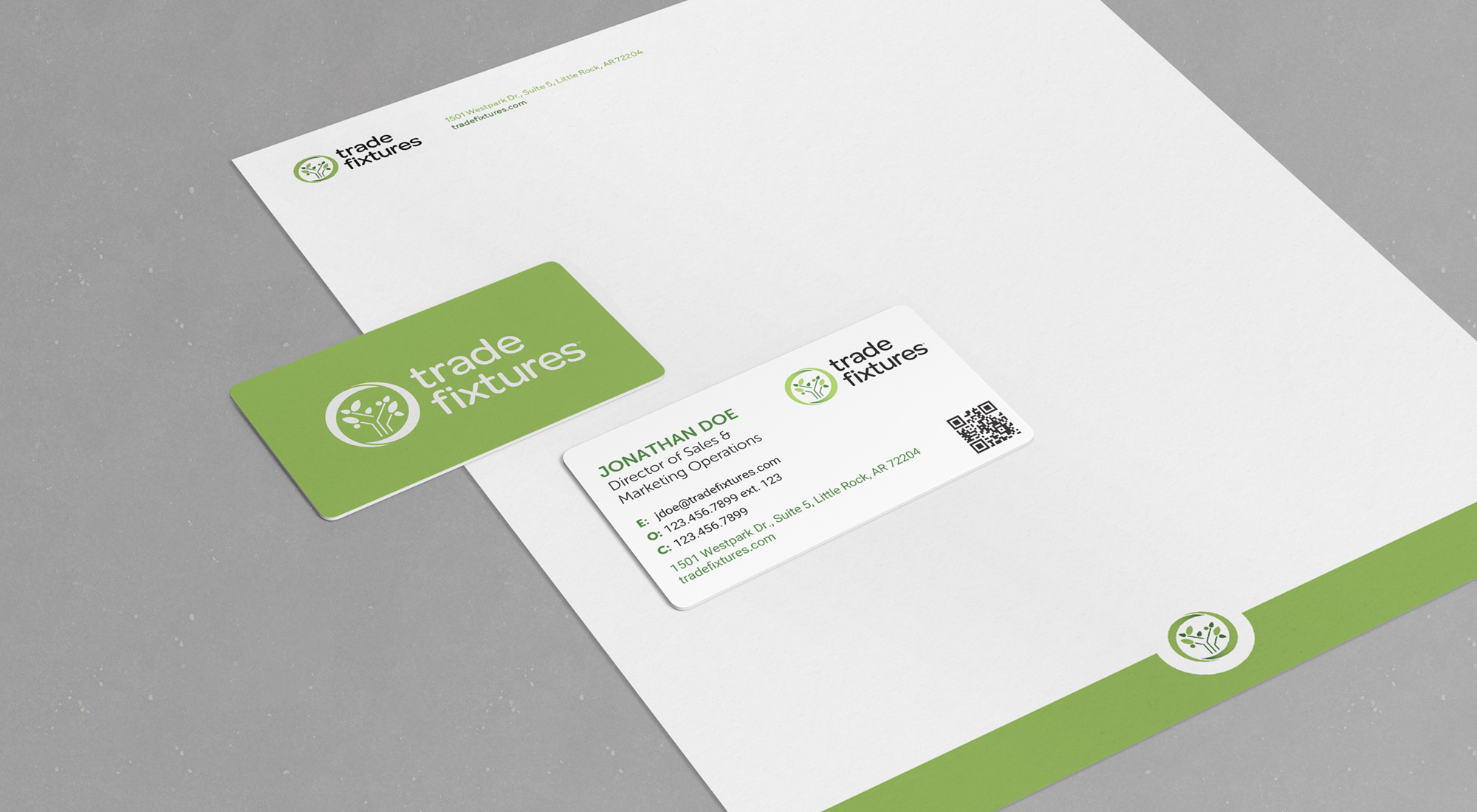
The new Trade Fixtures logo is built using parallel vertical and diagonal lines. These lines symbolize the company’s core product line – gravity dispensing bins – and form stylized trees, bushes, or plants that represent its commitment to sustainability. The outer ring on the icon winds in perpetuity to represent the circular economy, into which the bulk food product line fits.