the challenge
Glue Dots is a unique and amazing product. However, at retail, consumers unfamiliar with this spot adhesive had trouble recognizing the usefulness of Glue Dots in their lives. To earn better recognition on the shelves, C-22 updated the Glue Dots packaging design to deliver clear messaging and grab more attention.
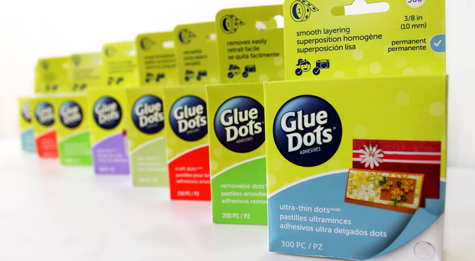
Before that could be done, there were some key challenges presented. First, the retailer required that three languages be used for all copy, all in equal weight. Second, the client required that we use existing package die lines and Glue Dots colors. Third, both the retailer and the client required that we make it clear that Glue Dots is both non-toxic and photo safe.
the approach
To meet the challenge, we started by limiting the amount of package text in order to improve the visual communication. This included adding large color swatches to help guide consumers through the levels of adhesive. Then, photos of finished projects were added to help customers visualize how the product could be used, and images of the adhesive dots were added to indicate its exact size and shape. Finally, icons without text were created to indicate that the products were kid-safe and photo-safe, and a visual meter was made to indicate the strength of the adhesive as compared to others in the line.
the results
The new packaging was met with strong customer approval and outstanding commercial success. This packaging was given credit for helping Glue Dots find its way to the shelves of big-box stores like Walmart for the very first time.
Customers raved about the new look:
I love the new boxes. As someone new to card-making this will make things much easier. I can choose the right box for the right job with a quick look.
This new packaging is wonderful! I love the different colors. It makes it easy to automatically be drawn to the correct package you need.
I love this!! I always want to know the strength and best products my adhesives work on! Love Glue Dots!!